Wk15: Rǝmix Culture

The freedom & fear, the empowerment & risks, of Internet Culture.

The freedom of internet culture is the ability to search anything at any time. Especially during this quarantine where people cannot travel or go out to the store, they have the ability to shop online or explore the world through different servers, pictures, and blogs. However, this freedom can also cause a fear of having too much freedom. A good example is the dark web where people can search up and do things that they are not allowed/should not be doing. But even outside the dark web, people still have the freedom to harass or contact people they should not be talking to. 

            The internet can also create a place of empowerment and supportive culture. Often social media pages or blogs are started to give motivation to others or to start mini communities of support groups. Also, celebrities and influences have the platforms to be able to spread healthy and positive messages to vast audiences. However, much like freedom & fear, risks are also tied to the empowerment of internet culture. Most of those risks from empowerment come from hate or cyberbullying from people who do not want those empowering and positive messages to spread.

Your thoughts about Copyright: is it working as is? Should it be strengthened, weakened, or modified?

            I follow a lot of art pages, and I still see a lot of them talking about art theft. Often art is not copyrighted on social media pages, because some of the artists are starting out with just their own art social media page and are not actually well- known artists in galleries. Their form of copyright is called a “watermark” or signature, but even then, art theives will blur out or crop out the watermarks. I think that any social media platforms should modify their “report systems” and have a direct link that would report art/post theft.

What license you’ve chosen for your work and why.

            For this specific work, I chose “Attribution.” I do not feel the need to ban anyone from using this piece because it is just a remix of different photos of my dog. I have seen a lot of artist do this kind of collage, so it is not my original idea/style because this is a popular style. Therefore, I should not restrict people from expanding on my piece or from taking inspiration from it. 

Your experience of making your Remix piece. How did you do it? Did it come out as you expected? Were there surprises? Challenges? Insights?

I decided to remix pictures of my dog because it have seen these art styles used often so I wanted to try it out. At first, it looked weird and the pictures did not sync together, but in the end I found the right pictures and I liked the result of the piece. I think one challenge was trying to find pictures that would fit well with the main picture I was using for the template. However, I have so many pictures of my dog I was eventually able to find some I could use. I really liked this style of editing; I actually think I would do something like this again and use more pictures of my dog.
Wk:14 Painting (Graffiti Writing)

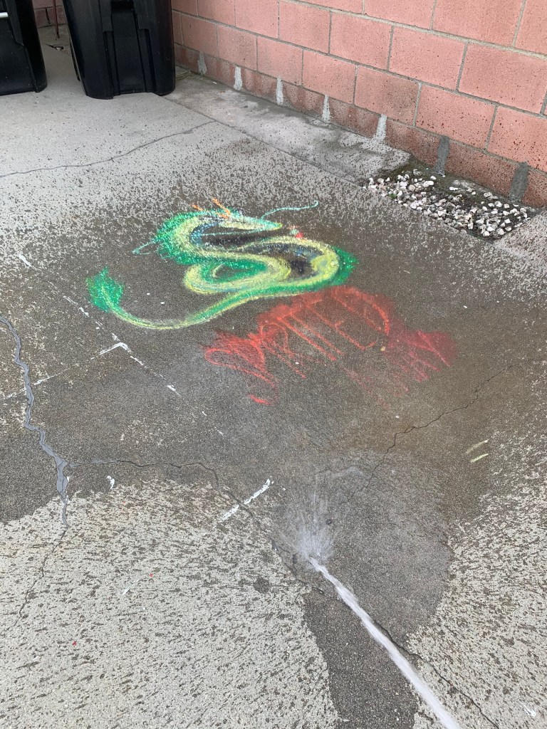
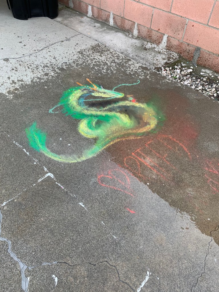
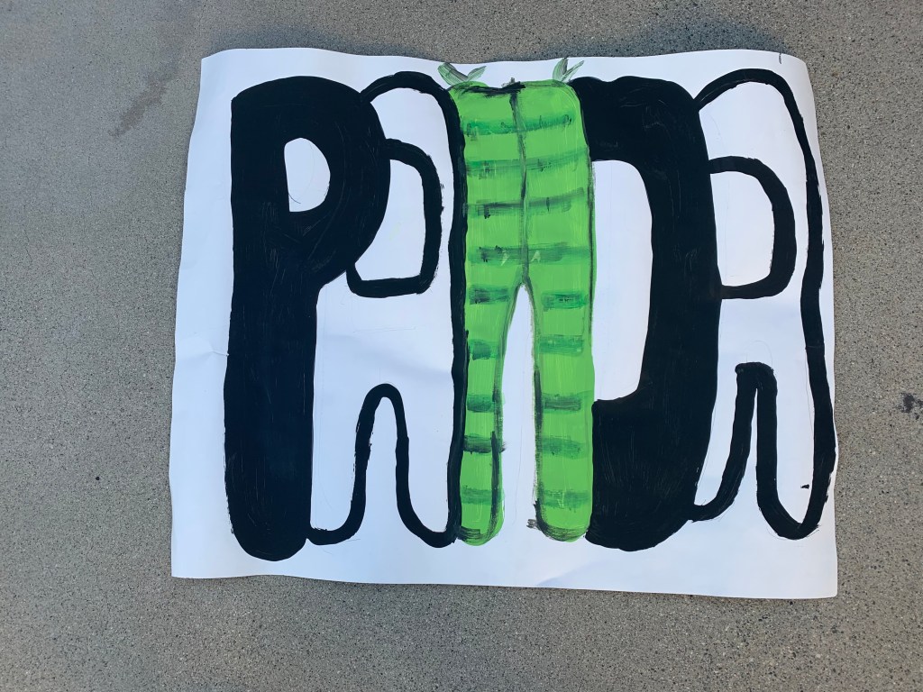
This was an interesting project because I do not ever draw in “graffiti style” so this was a first for me. I have tried bubble letters before but not in this style. However, I believe the experience would have been different if I was able to go out and buy some spray paint, because unfortunately I did not have any at home.

I decided to paint out my nickname instead of than painting out my name. This would also give me more room on my poster paper.

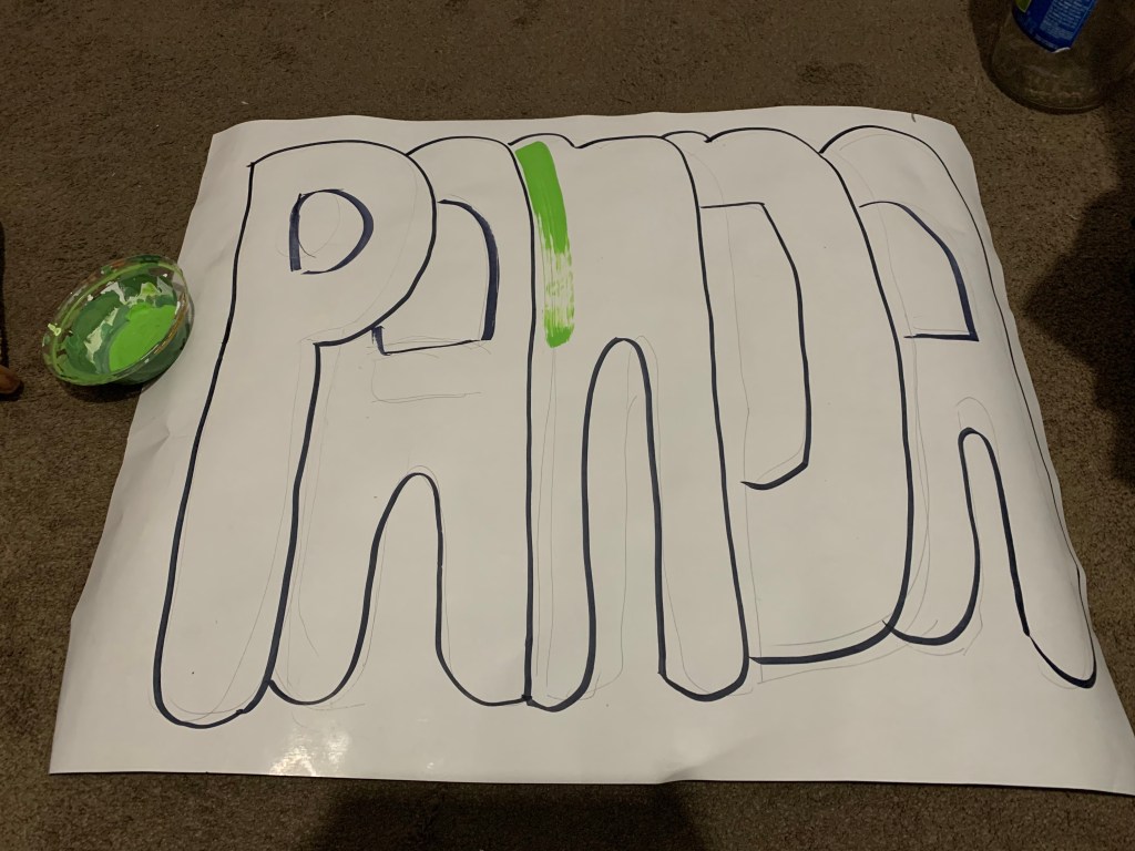
I started out by drawing out the outline in pencil, then I traced it with a black marker. Once I had my outline, I decided to paint it. My sister gave me the idea to leave the name in black and white to resemble a panda. However, I wanted to add more color so I decided to make the letter “N” in the painting resemble bamboo.

I do not think I would voluntarily do another project like this because I do not usually like painting in this style and I do not like painting letters/words but this was an interesting and fun experiment.

Artist Conversation #5

Artist: Micol Hebron

Media: Photography (+multi-media)

Website: http://micolhebron.com

Instagram: https://www.instagram.com/unicornkiller1

Micol Hebron is a multi-media artist who also works in collaborative projects varying from curator projects to gender-awareness projects. Hebron mainly focuses on “non-fabricated object” pieces such as performances, videos, or digital and live media. One of her main goals/themes in her work is to express modern feminism and discuss the exploration of the human body among social media platforms and in modern society. She explained during the meeting that in her recent work on popular social media platforms, her goal is to challenge the platforms’ implications and standards on “what is acceptable” in society regarding censorship (specifically human body censorship and censorship that determines what is and isn’t art). Her works on social media specifically focus on experimenting with social media censorship of female nipples vs censorship of male nipples. 

Her work involving the discussion of female vs male body and how they are viewed differently among both social media platforms and in society mainly focus on human nipples. Hebron often explores this concept by taking pictures of her nipples and posting them on social media in order to see how fast her post will be taken down due to violation of “safety guidelines.” She stated that she would repost her pictures with various “censors” such as a blurred image on top of the nipple or a line covering her breasts. She explores different filters such as putting stickers over her nipples, covering them with her hands or with gloves, and even dramatically photoshopping more nipples to cover her own nipples. In addition, a lot of her works use bright colors and distinct patterns in the lines or shapes that she uses to “censor” her nipples. Hebron discovered that most social media platforms focus on taking down posts that explicitly show female nipples, and as long as they are covered or blurred, the post typically remains up. Her most “famous” way to create her photography pieces is to add male nipples over her own female nipples, either through photoshop or by using stickers/pasties.

A lot of the questions that were asked during the class period, consisted of “Why is she doing this kind of work?” and “Why does she feel that it is important?” Her main responses were that she feels the need to normalize the female body, because often it is discriminated against through double standards. She explains that male nipples are not banned on social media, and in society pictures of shirtless men are acceptable. Hebron explains that these platforms are also creating a sort of “wide-spread ideal” of what is acceptable and unacceptable in society. She continues to explain how these platforms basically create a standard and have the capability to decide what is and isn’t art through their “nudity” guidelines. In addition to protesting the norms society holds between female and male bodies, she sees value in expressing herself and expressing the human body through her work. One question that someone asked was “Why use these [social media] platforms if you can possibly create your own where you can post anything you want?” Again, this ties back to breaking the norms these big social-media platforms create. It makes it more of a protest if she uses those big platforms.

After watching and listening to Hebron during class, I immediately chose her as the artists I would write about in the “artist conversation” because her work really resonated with me. I agree that her work is very important to challenge the double standards that society imposes on humans (female vs male) and I really respect how she is actively challenging the social media algorithm. I never realized that social media specifically bans the sight of female nipples but allows male nipples, and I agree with her that these guidelines are very gender biased. One thing that she stated that really stuck with me was that the female body is almost always viewed in a sexual way, but the male body can be plastered everywhere shirtless and no one really cares. I feel that her work and goal of normalizing these gender double standards really ties down with how society views female vs male anatomy and I really respect that she is challenging this by posting pictures that experiment how the female body is censored. Moreover, it can reshape how human bodies are viewed and change how female body parts are over-sexualized even in artistic contexts.

Wk13: Sustainable Art

S U S T A I N A B L E S C U L P T U R E

Ephemeral Art


What was your idea?

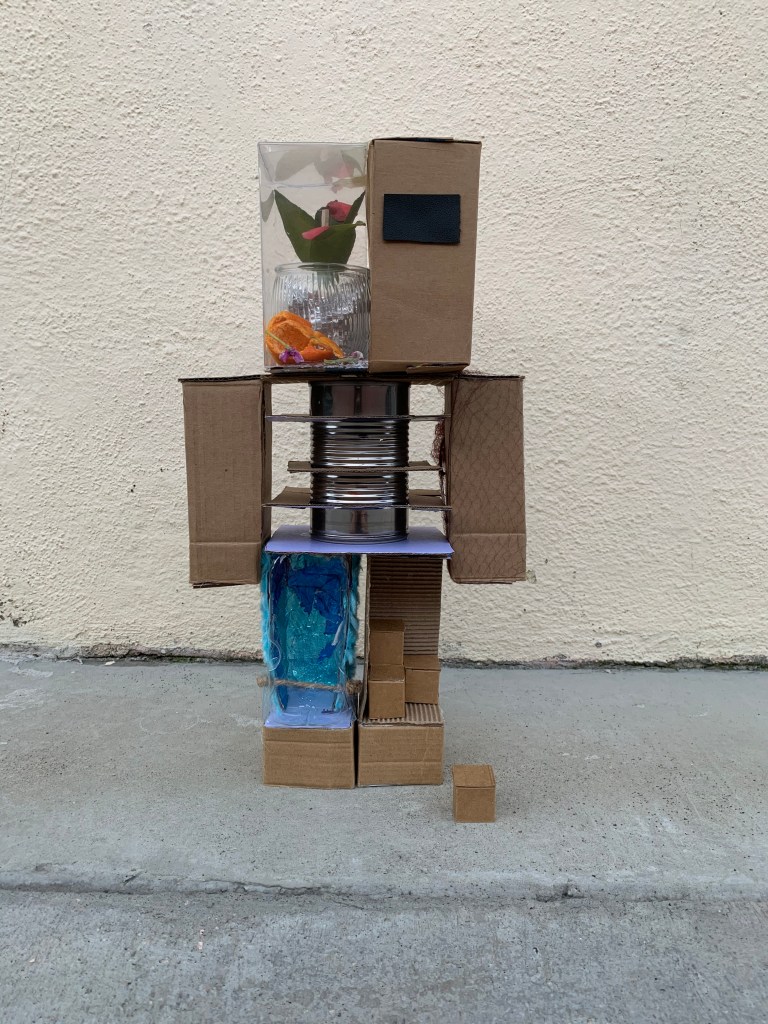
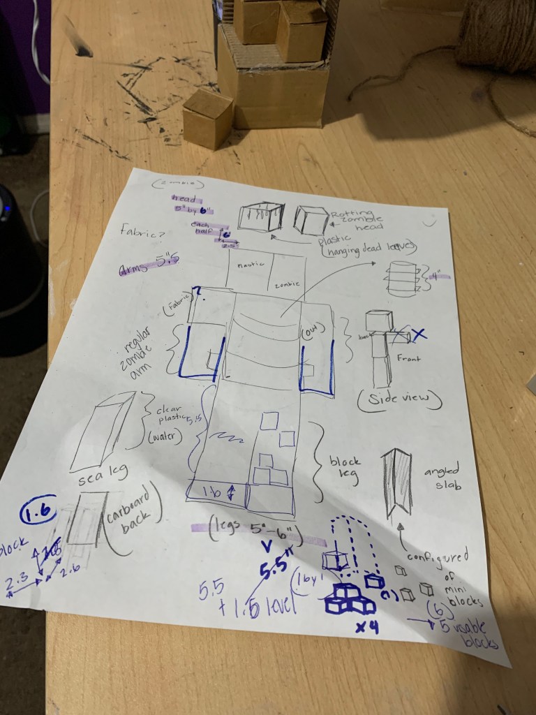
I decided to make a sculpture based off Minecraft characters because I have made one before made entirely out of cardboard. Since I enjoyed the result of the first one I made, this time I wanted to make a bigger figure and incorporate more “reused materials” instead of just using cardboard.

What materials did you choose?

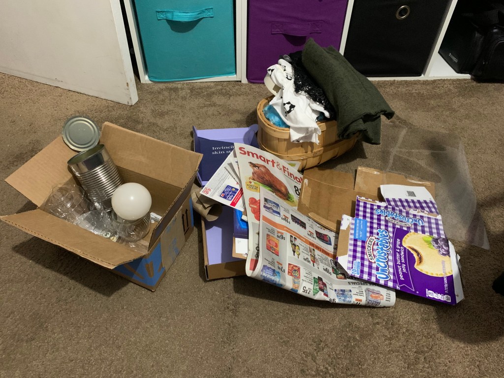
I went through the recycling bin at my house and I found a lot of cardboard that I was able to use. I also decided to use a metal food can and a glass container I found that my sister threw out. Since I could not use any paint or colored paper in the piece, I used a bunch of blue gum wrappers to add some color to one of the legs. I also used leaves from my backyard and some orange peels to add color inside the head. However, I had to use some glue, tape, and string to be able to hold the sculpture together. I did try to minimize my use of those martials by not attaching the body together, instead they are just stacked on top on one another (separated into 4 pieces). 

Full list of materials:

CardboardTin canGlass container leaves
PlasticOrange peelsGum wrappersstring
Plastic sheetsUsed tin foil Thrown out fabricUsed hair net

Do you think your piece was able to express your idea?

Yes, I do think that my piece was able to express my idea and I really liked the result of my work.

How did your choice of materials influence the experience of your artwork?

I had a general idea of what I wanted to create, so first, I had focused on finding some cardboard from old boxes or packages and from food items. Then, as I found more materials, I slowly designed the sculpture based on the materials I was able to find. overall, this project forced me to work with what I could find, rather than going out to buy things that I needed. These materials also affected my experience because I was limited with what colors I could use because I could not use paint to create the textures I wanted. However, I still enjoyed the project of making a sculpture from “found materials”

How long should a kiss last?

I guess it would depend on individual preference. 

How long should a great meal last?

This is another thing that would depend on individual preference. For example, in make case, the more I like the food, the faster I eat it because that I how I like to enjoy food. Typically, if I don’t actually like some food, I would eat it a lot slower.

How long should a work of art last?

Some works do not take much time to create but that does not make it less valuable than a work of art that took really long to create and I think the same goes for how long an art piece lasts. I believe that as long as you enjoy the result of a piece, it does not matter how long it lasts.

How long should a marriage last?

Ideally a marriage should last for the rest of the couples lives since it is a life-time commitment. However, in our society, it is much more common now to get a divorce than to forcefully stay married to someone. So, now it is best to end a marriage if it clearly isn’t functioning.

How long should a human life last?

I believe that the current life expectancy we have now is a good lifetime. I feel that if humans were immortal, a lot of people would not value their life as much. They may feel that they have an infinite amount of time to do things, therefore they would lose motivation to get things done and accomplish things throughout their life.

Does the fact that some things, like ephemeral artworks and human lives, have a finite time and then are gone make a difference in the way we experience them?

Yes, I do believe that because we know that something is finite, we tend to cherish it more. Our experience is different because we know that if we do not take the time to fully experience something, we can miss our only chance. On the other hand, if something is infinite, we tend to claim we “have all the time in the world” to experience it, and that leads us to not appreciate it fully. Even now, when we lose something people often use the expression “you don’t appreciate something until it’s gone” so I can imagine that humans may not appreciate something if it were infinite.

Should other things, like clean water, air, and land be sustainable and long lasting?

Ideally, yes, these things should be sustainable and long lasting, but humans often think that these things are infinite and do not treat these resources carefully. We overuse them without realizing that they are finite resources that will eventually run out if we do not use them wisely.

Can one person, like you, make a difference in a global problem like Climate Change?

I believe one person can make a difference because they can set an example for others to follow. Often this is the way trends spread around the internet, it can work the same way if even just a single person uses their platform to spread important issues. 

Wk12: Virtual Art Gallery

M I N E C R A F T

Theme

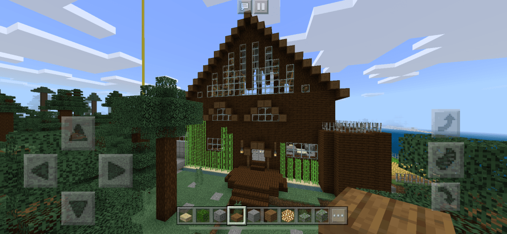
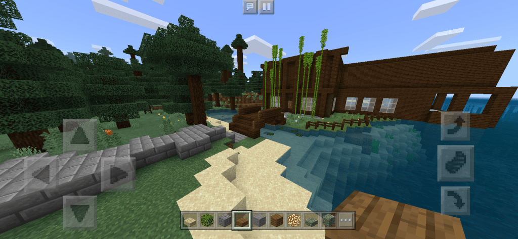
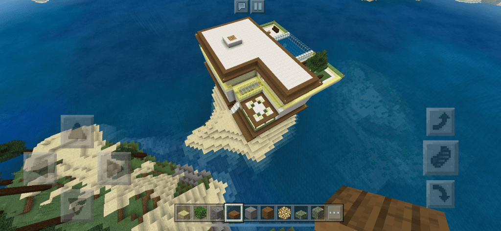
I do not use any multiplayer games other than playing games with my family, so I decided to have my family members create a house in Minecraft in order to explore their individual styles. My theme for my virtual art gallery will focus around the individual expression of one’s style when creating a house or a building in Minecraft. With the many different textures and block colors on Minecraft, I figured it would be a great place to have my family members build their own houses based on a style they wanted to express. In this theme, I want to focus on showing different aspects of my family’s houses on Minecraft and how they differ from person to person. There is no specific color scheme or house design in this gallery because I wanted my family members to explore their own style with building.

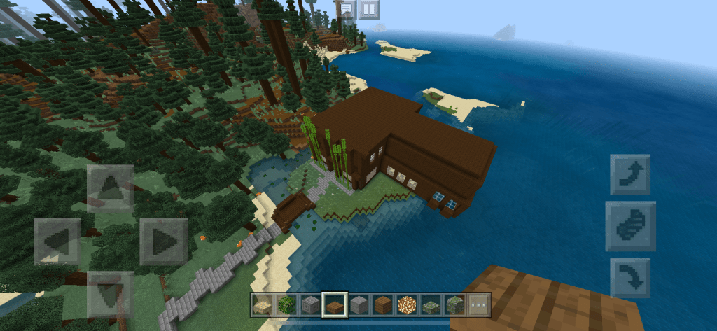
Emily: Getaway Island

My youngest sister stated that she was “going for a mansion.” She took ideas from watching Minecraft YouTubers and using that she was then able to develop her own style. In this specific house I noted that the main highlight was the very large and exaggerated roof. Many mansions have large roofs so that is why I believe my sister decided to make the house with such a large roof. I think that the layering of the windows also add depth and a unique design to the house. I agree with her that she chose to take inspiration from mansions because when I first saw her house, I noted that it looked like a mansion. I also noticed that she took the time to add in what looks like a private beach/dock in the back of the house. A few other details that are worth noting are the large balcony on one side of the house, and the side patio exit that leads to the private dock.

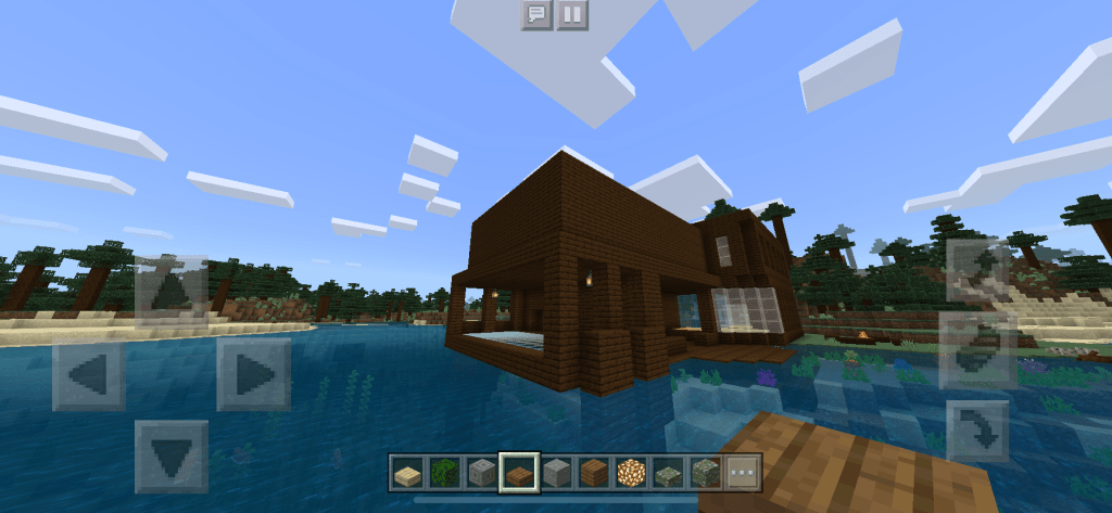
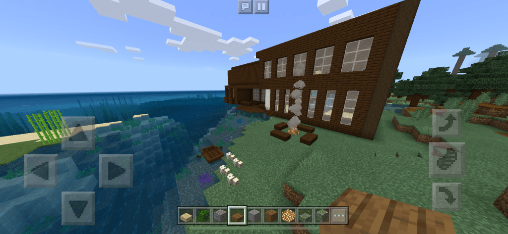
Stephanie: Sea House


My other sister wanted to create a sea house, she also incorporated sea elements in the design of the house. Her inspiration was the ocean. The first thing I noticed about the house was the glass-floor corridor on the side of the house that hovers over the ocean. I can definitely see how she incorporated sea elements into the house despite not using any “ocean inspired” colors. The location of her house also adds to the ocean theme she was following because the entrance to her house is above a stream that leads back into the ocean. I also noted that are large chunk of her house was built directly over the ocean and is hanging off the island. A few details of the exterior of the house that I enjoyed were the glass floor corridor that hung over the ocean, and the ocean side campfire she set out. Next to that campfire she also placed a few sea turtle eggs to hatch and attract sea turtles. Unlike my other sister’s house, this house does not have a large roof or mansion-like designs. She did not focus on making her house look detailed like a mansion, she instead focused on adding hints of ocean inspired designs into a solid color house. Both of the sisters houses are similar in color but they both express distinct personal details.

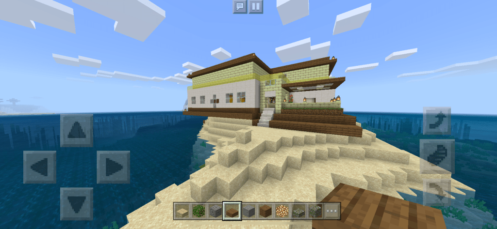
Mom: Summer Vacation

My mom stated that she wanted to focus on “simplistic architecture” with modern and colorful (full of life) designs. Her inspiration came from her own thought about what kind of house she would like to have. Her house was the most different among the ones my family made. She was the only one that incorporated a lot of color into the design of her house. The main thing I noticed about her house was, again, the color because most of time when I am building on Minecraft I usually do not use a lot of colorful blocks. One thing I really liked about her house was how the different levels of the house have different depth levels, with the base of the house sticking out more than the middle. Much like my sister’s house she also has a chunk of her house hanging over the ocean. I found it interesting that she also suspended a pool over the ocean also like how my sister suspended a corridor over the ocean. Often, when making house, she also likes to make patios and porches (as shown in the pictures)unlike the rest of us. I feel like her house shows the most distinction of personal style because it is the house that looks the most different.

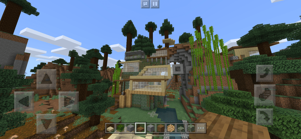
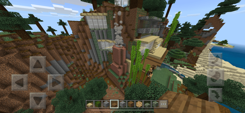
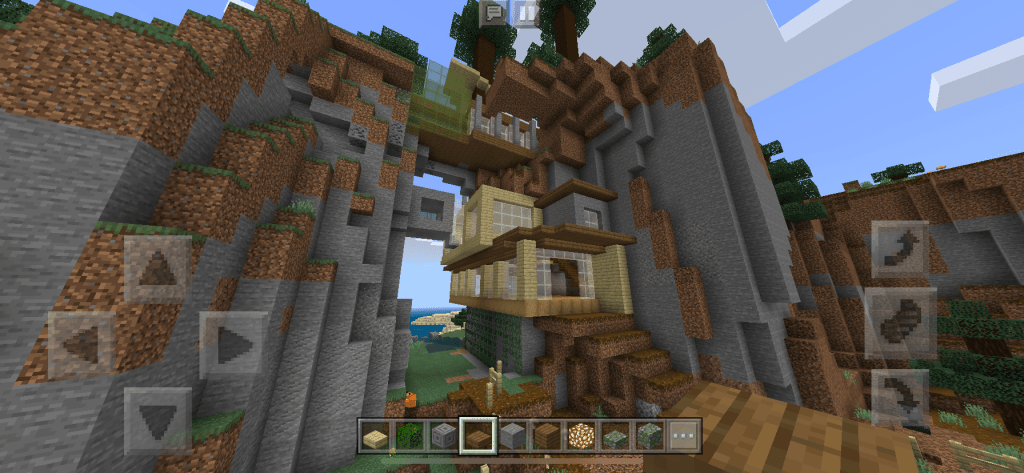
My Mountain House

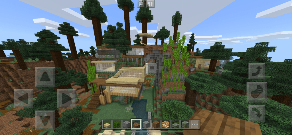
I also decided to make a house and add it to my gallery. I created my house following a more modern and sleek design. Most of the time I like to build my houses coming out of a mountain or a cave, and even sometimes hanging off a cliff. My style is also distinct compared to the rest of my family because unlike them I do not like building my house out in the open on flat ground. I like to incorporate the landscape surrounding my house.

Wk11: Vlogging

What was your goal with your video?

My goal in the video was to vlog my pets. I wanted to do a fun vlog that would not just center around me talking to a camera about random things. So, I decided that I would involve my pets in a vlog. 
Did you accomplish your goal? Why? Or why not?

I was able to successfully accomplish my goal. In the end I decided to make my entire vlog about my animals, and I am very happy with the results. 

What would you do differently next time?

Next time I would like to add in my other family members’ pets, such as my grandmother’s birds. She has a lot of birds so I think it would be fun to do a video on all her birds and a video on her garden where she keeps those birds.

Do you think you’ll ever vlog again?

I honestly do not know the answer to that question. I have always wanted to try YouTube, but I really hate videotaping myself. I do not think I would be able to handle editing my own videos and having to repeatedly listen to my own voice. It was a fun project, but I think for now I will just stick with art videos where I do not have to speak or show my face. 

Who is your favorite YouTuber? (not counting heyit’smay, Emma Chamberlain, Natalie Tran, or any of the YouTubers on this page)

One of my favorite YouTubers (who I also take a lot of inspiration from) is the YouTuber known as BestDressed. She runs a fashion/vlog channel where she posts a lot about fashion and thrifting videos. Her videos on styling thrifted outfits are typically my favorites. 

What about their work appeals to you?

I love her work for a lot of different reasons, it is kind of hard to name every reason. But to name a few, I enjoy her aesthetic, personality, and overall content. It is hard to explain her aesthetic, but I really enjoy the style of her videos and how she edits her videos. I also love the content of her videos; if I didn’t then I probably would not be watching her. Her content also includes other fun side vlogs in addition to her usual fashion content. 

What lessons can you take from their work to apply to your own vlogging?

One of her tips that I already incorporated in my vlog was the hand-drawn transitions. In one of her videos, she recommended that for using text in videos, you should try to draw them by hand to add to the aesthetic of a video. She also suggested to add two different frames to make the text move around (as it did in my vlog). I really liked that tip, so I used a sketch app on my phone to draw out my transitions then later inserted them into the video. 

What is Authenticity?

I believe authenticity means showing personality aspects that are true of oneself without being influenced by other motives such as “fitting in.” Being authentic can simply mean not trying to be a follower of a something just because it is popular, or because it is a trend. I believe it can also be a form of “being yourself” despite any negative feedback or despite being different from the rest of society. Authenticity does not involve trying to be someone else, or faking aspects of one’s personality.

What is Performance?

I believe performance means it is an act, or it is something that is pre-planned, and can be rehearsed and recited multiple times. In a way performance is also for done for attention and/or done for an audience. 

Are Authenticity and Performance opposites? Or can they exist together? Explain!

I believe that authenticity and performance can be opposites and can also exist together; it just depends on the situation. They are opposites of each other because in most cases, performance usually means loss of authenticity because once the prosses of developing a performance begins, it is no longer a personal and unique (authentic) interaction. Now it is only a preplanned performance piece. However, in some cases they can exist together because a performance can be based off of ones’ authenticity. For example, some influencers go on tours and each stop is like a live talk between the influence and the fans; making each interaction more authentic.

Below are 2 clips of Jennifer Aniston on the Jimmy Kimmel show – one in the studio and one from home during the coronavirus pandemic. Do you think either clip is more authentic? Is either more performative? Why or why not?

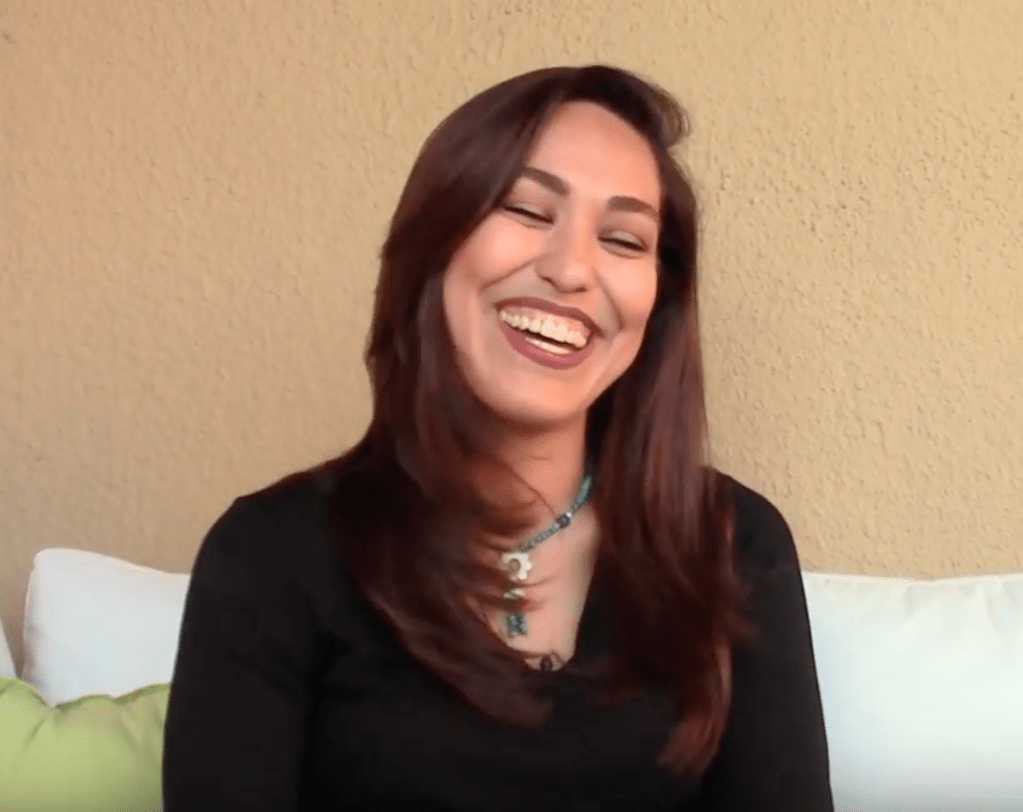
After watching the two clips, I think that both clips are in some way authentic. Aniston’s personality does not seem to change drastically between the two clips; however, at home she visibly looks more comfortable. I believe that the setting is what causes her to shift a little because in a studio, it requires a more professional attitude than when at home. Some aspects of the clips can also be more performative, such as her choice of clothing between the two clips. The video in the studio needed a fancier outfit, while in the video from home, Aniston is just in normal clothing. Because her personality does not drastically shift while comparing the two clips, it shows that she is still trying to be authentic in both situations. However, the video in the studio is more perfomative because it was a scripted show with pre-planned segments and certain “professional norms” that needed to be followed.
Artist Conversation #4

Photo from 7500 Miles Gallery
Screenshot from YouTube interview of Mahsa Soroudi
Artist: Mahsa Soroudi
Exhibition: 7500 Miles 
Media: Mixed Media; Painting
Website: http://www.mahsasoroudi.com

Mahsa Soroudi is an Iranian artist who was born in Tehran in 1981 and earned a BFA in Painting from Sooreh University. She grew up in an art-enthusiastic family, that supported learning about various arts and cultures. Since her father was also a painter, Soroudi stated that ever since she was little, she felt a very deep connection to the fine arts. She also mentioned that growing up, she also traveled a lot, and that helped her learn and experience different cultures and art forms. Once married, she went to live in Malaysia for almost a year, and there she learned English. Soroudi currently resides in southern California. She hopes that through her work, people can experience the lives of women as individuals and not through a filter of stereotypes and through expectations other cultures may have. 

               Her piece that I am focusing on is a painting that features a vibrantly colored women in front of an almost “monotone” background. It is very obvious that the main focus of the piece is the woman because, unlike the background that focuses on using darker “monotone” shades of green, orange, browns, and white, a bright pink color is used to paint the main figure. The background also seems to be a random application of those colors, with the white and green splattered on top. I can describe the colors under the green and white as almost rust-like, the colors put together mimic a rusty texture that is even further visible through the sharp scratches that can be seen in the background. It reminds me of a worn-down building. Unlike the background, the woman in the middle is very detailed and precise; painted in a single color. However, the artist still uses various shades of pink for added detail in the piece. Compared to the background that has a rough and blotchy texture, the main figure is very smooth. In addition to the main figure’s vibrant color, the woman also takes up most of the canvas space. 

               During an interview with Mahsa Soroudi, one of the questions that were asked was about the various artists that can be found in the exhibition. She stated that she first started the exhibition with the artists/friends she went to school with, and through those connections she found even more artists. However, currently she opened up a call for submissions in order to be able to contact a larger “pool of artists.” She hopes that with a vast number of different artists in the exhibition, it will provide different perspectives for the show. She also says that she hopes that new upcoming artists can also take part and grow through this exhibition. Another question that was asked during the interview was “What should they [US Artists] know about the work that is being done there [Iran]?” Soroudi starts off by saying that the arts in Iran are now “really dynamic and [it’s] really brave and bold,” and she also emphasizes that the artists’ works do not focus on stereotypes that are typically represented by the media. In this particular exhibition, she does not want to focus on cliché or political aspects of the art, and instead focus on the individualism found in the art. Overall in the exhibition, she wants to show that Iran is not what the media thinks, instead of being a country caring only about domestic issues, Iran is also a country that cares about global issues. Soroudi’s main goal is to present the art in a place where people can “see” it without those stereotypical and cliché filters.

               The painting in the exhibit (from Mahsa Soroudi) that caught my attention was the one I described in the second paragraph. The reason it caught my attention was because of the vibrant pink color that was used to paint the main focus of the piece. I was also interested with how the pink contrasted very well with the rusty background of the painting. The background reminded me of an old worn-down building, or a rusty wall of a storage container hauled by a train. I feel like the main contrast between the pink woman and the background is the most important statement of the piece. The woman is supposed to be the center of the piece, but one might question why she is painted with only one color despite the background using more variation of colors. I believe that the woman being only one color just reflects the artists view to be “sure of themselves”. Often a mix of colors can mean uncertainty, through the single color and smooth detail of the woman, the piece reflects a sense of “certainty” and individuality. The contrasting textures of the background and the women also show that sense of certainty because the background is very worn-down and scratchy, while the lady remains smooth. I believe this contrast between the textures can also portray self-assurance because unlike the differing scratches and splotches in the background the woman can overcome those “flaws” and “accept herself.”

Overall the aesthetics of the piece is also very beautiful and eye-catching.

Wk10: Drawing (Automatic)

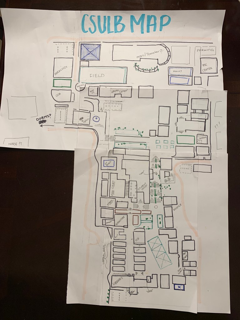
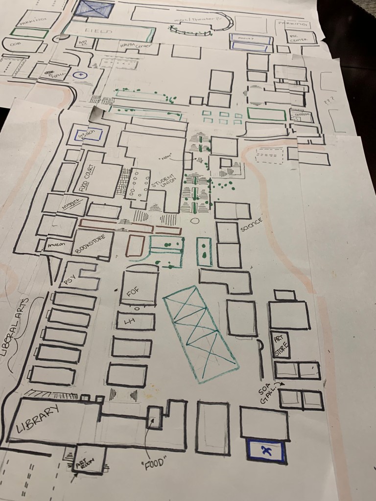
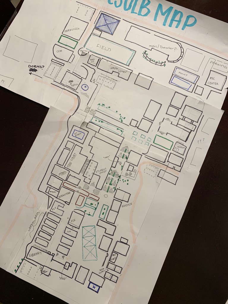
C S U L B C O G N I T I V E M A P

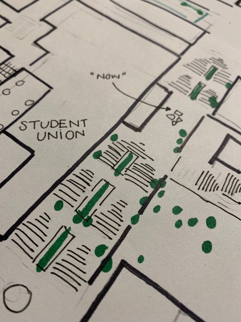
I started with the areas around the Liberal Arts buildings and the Library because that is where is spend most of my time on campus. However, despite passing the library almost daily, I had a difficult time remembering the layout of the buildings to the right of the library where the “Beach Hut” is located. I tried my best to work my way down the campus and tried not leave gaps despite not knowing what buildings where there. I only labeled the buildings I know by name, I found that I had forgotten the names of the buildings despite previously taking a class there. However, most of the time I had to rely on just remembering that a “building was there” the few times I have walked through certain areas of the campus.

In the end, I honestly remembered a lot more than I thought I would. It was quite easy to remember the outline of the places I visit often, but I had a hard time with other sections such as the side where the Rec Center is, and where the dorms are located. I had an especially hard time figuring the layout of the section behind the student union/behind the “GO Beach” sign, I had to leave a messy gap. However, it was a fun project and challenge to really see how much I actually remember of the campus layout.

H U M A N S P I R O G R A P H

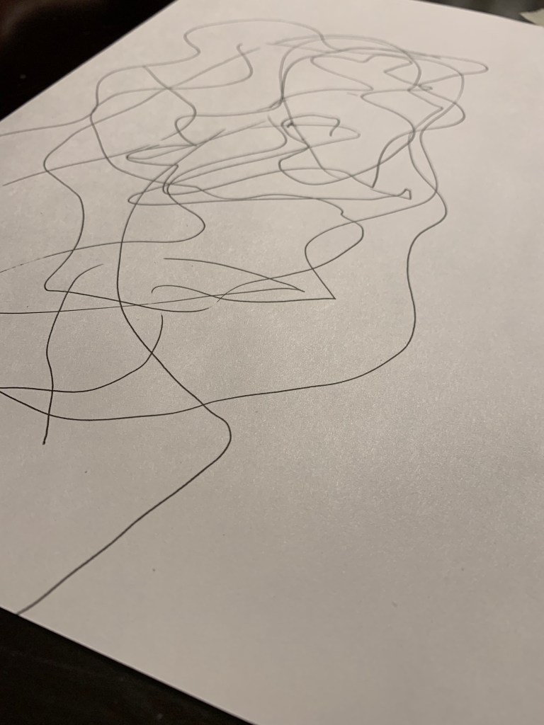
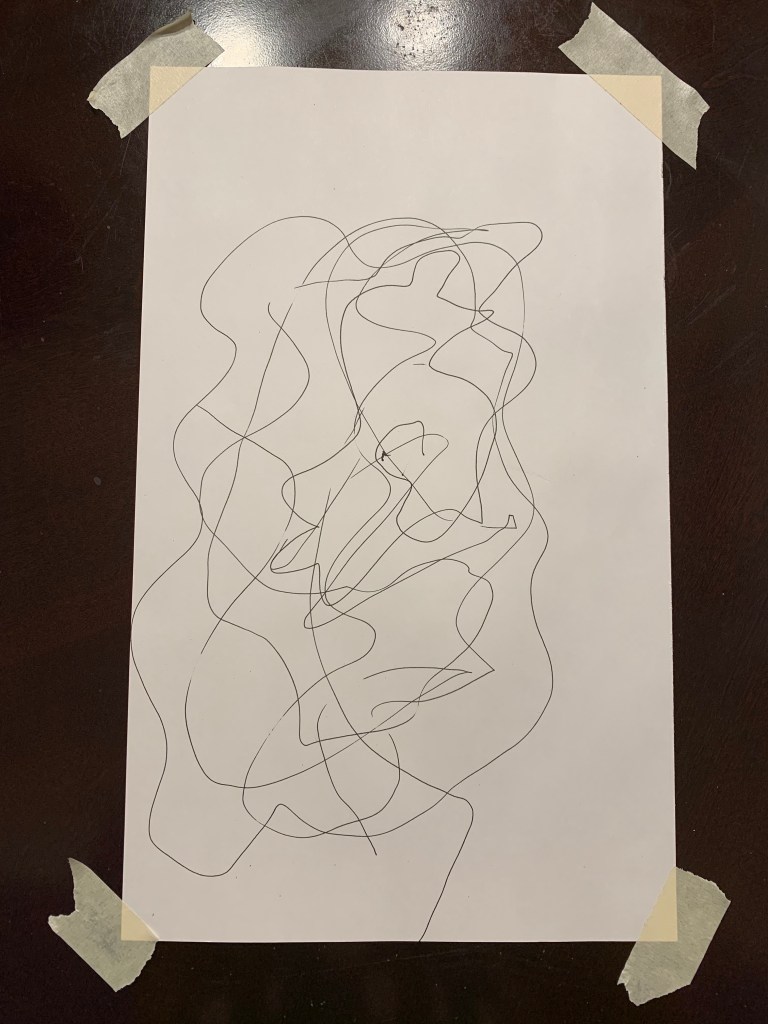
I conducted the project with the help of my mother, and we drew the piece on the kitchen table. At first it was a bit awkward because we had my younger sister making sure we did not go off the paper and draw on the table since our eyes were closed. My mom also kept asking how much longer she had to endure this task. In the end she actually liked the project and thought it was an interesting way to “draw.”

While drawing, it felt like we were drawing in a circle that started off small and just got bigger as we went around the paper. However, when we opened our eyes and turned the lights back on, I was surprised to see that the drawing on the paper was not even close to a nice spiral circle. There were a lot of rounded edges where we turned in the other direction but it did not feel that way while we were doing the project. There are also a lot of sharp angles that appeared throughout the piece, that again, I did not feel while drawing.

Artist Conversation #3

IG// @siennabrowneart
Artist: Sienna Browne
Exhibition: Product of the Palette
Media: Mixed Media
Website/Instagram: @siennabrowneart (.com)

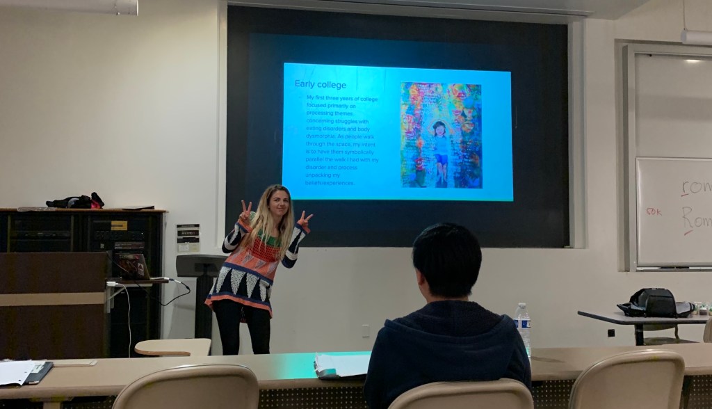
Sienna Browne is a BFA student at Cal State Long Beach. She is currently working to present a solo exhibition titled “Product of the Palette” which will feature some of her works ranging from 2012-2019. The main focus of her upcoming exhibition is to “celebrate the past” and honor the process of transitioning through the different stages in one’s life. Most of her work also focuses on this intrinsic value of human creation. She stated during her presentation that while working on a piece, her subconscious thoughts/emotions surface and show themselves through her work. She mentioned that for a large period of her life, her work reflected her struggle with an eating disorder. She hopes to focus on her life’s work timeline in her exhibition; ultimately showing her own growth and recovery and then moving forward towards her goals/future achievements. 

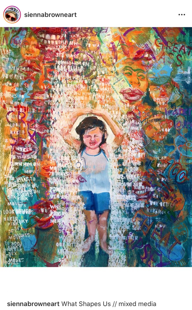
One of the pieces that caught my attention was one of her works dealing with an emotional distress that was titled “What Shape Us.” The multi-media piece displays a young girl walking through what at first glance looks like a vividly colored walkway. However, looking closely, one can see that the young girl is trying to protect herself from the explicit words/concepts coming from society. The piece shares a vast amount of different shapes and colors that merge together to form faces of people (spectators). The use of vivid colors is very eye-catching, and they also create a focal point around the girl in the middle of the painting. Up close, one can see that the faces painted in different colors are also in many different shapes and sizes. There are also lots of ‘words’ and ‘phrases’ displayed in white around the girl, which contrast very well with the colorful background of people. The piece seems to be rather large because it has so much detail to display, such as the colorful faces and the words written around the middle. It is important to note that the only part of the piece that is not diversely colored is the little girl in the middle. Unlike the faces that are multicolored, the little girl is painted like a “typical” human being (“skin color” and natural hair color), the rest of the faces have brightly colored features.

One of the questions asked in class was “Does the theme [of the piece] translate into the colors?” She responded that often she explores colors and themes that might contrast each other. She says that often vivid colors draw people in and invite them to admire a piece because of its color. However, she said that this initial impression can cause confusion once the person looks closer and realizes that the theme of the piece is actually quite “dark.” She says it leaves the views asking why they would be attracted to a painting that deals with a dark theme. Another question that was asked was “Is there anything you did not explore that you wish you could do?” Browne responded by say that she “had to do what she was doing” and that she “did not have a choice.” She feels that her time with a theme is not over until she is completely ready to move on. I really understood what she meant by “having no choice” because often as humans, our internal emotions surface when we do not notice, and I feel that art is a really good way to let those inner emotions out unconsciously.

The main reason this piece caught my attention was because of its theme and contrasting presentation. The piece deals with a very harsh reality of society, yet it is presented in a colorful and almost inviting matter. I found this contrast very interesting. As the artist mentions, the color draws the people in but then they see the reality of the piece. I feel that it reflects how society and “fitting in” is viewed as a very colorful and important thing to do; especially in the eyes of youth, fitting in is viewed as “crucial.” However, the piece explores how even behind all the “color” of society, there is also a more explicit setting. I believe that children begin to lose their innocence little by little as they explore more of society and reality. I feel like this work is a reflection of that internal struggle and loss of innocence to a “colorful” society, which is why I think the artist chose to use a young child as a focal point instead of an older person. Especially now, the internet provides children with easy access into “society” and all of its content. Children are now losing their innocence much faster now that a phone can give them access to virtually anything on the web (without parent restrictions). 

Wk8: Writing a (romantic) Pop Song

“134 Days of Silence”

Two, three, four, 
Hours is what spent spend
Never forgetting to remind us in the end 
Yet, you thought our trust was broken
When someone from your past decided to be “outspoken” 
No need to apologize
Your past does not define you,
But why did you have the need to fall behind,
Incomplete is how you left them,
Thinking you were stem of the dilemma
We are here, we won’t leave. 
Don’t think your past is only what you mean.
Millions of us still waiting to hear.
Lucky number seven 
We never leave our place
Distance and time mean nothing 
past, present, future
We look up to you
We learn from your kindness
Up on stage, you bring comfort 
We never like to accept that our time is mere numbers.
Hundreds of protests
Tens of News articles and more
Im sure your company thought we were pests, 
Constantly emailing, demanding for clarification
And begging for ways to end your defamation.
134 days is what it took
To hear that you were no longer bait hanging on a hook…
"From zero", restart what they have taken.
You haven’t lost, 
Instead, realize what you have is unshaken
“more than yesterday, today, no more than tomorrow”
We thank you for your hard work,
And hope to see you back,
All our seven.


What were you trying to think about in your song?

I wrote my song about Monsta X’s former band member “Lee Hoseok” (Wonho); I did my “Shocking Art” project on him as well. I was having a really hard time trying to come up with a topic for the song, I did not want to pick a random topic that I would have no “emotional attachment to.” Then on Friday, my phone notifications were blowing up with the news that Wonho was finally cleared of the accusations put on him and that he will still remain as part of Starship Entertainment. Out of excitement, I decided to make him the topic of my song. In the song, I focused on how he was not heard from in months because he was “kept out of the media’s attention” in order to follow through with the legal issues. Now that I look back on the lyrics, I realized that I wrote the song directly to him. At first it was not my intention to write the song directly to him, I just started writing my thoughts down but I wrote it to him subconsciously. I wanted to express how he should not have to worry about coming back after all the accusations and back lash he received because of the media’s cancel culture. Another reason why I focused on writing about his return was because in one of the interviews released after the news of his return, he shared that he felt sorry about all the trouble he has caused. So, this song is a reflection of how us fans do not want him to come back still feeling like he is a burden to his group. I feel like this is important because even when he left back in October he shared that he felt like a burden, and I do not want him to still have that feeling linger.

What was your process for writing your song?

I first I tried to write the song in chronological order, of course starting with the beginning of the song. However, I though back to when I did creative writing, I would almost never start from the beginning. So, I tried to mimic “thought flow,” and I began just writing what I was thinking. It worked a lot better than forcing myself to work in order, but I still had a really hard time finding the flow of the song. I found myself trying to force rhymes into the song, although some rhymes worked, others sounded off. In the end I realized that the rhymes do not matter as much so a discarded the forced rhymes and kept a few I liked. Once I had my thoughts down, I picked a few of my favorite phrases and arranged them into an order that flowed with the main idea.

Was it easy? Hard? What you expected? Surprising?

I found song writing very difficult. I had already expected that I would have a hard time because I never really liked the idea of writing poetry. Ironically, I really enjoy creative writing (writing my own fictional stories) and writing my thoughts down if I’m having personal issues; however, I find song writing too difficult. I enjoy getting my thoughts down on notes in order to express how I feel, but I do not like having to worry about rhymes or lyric flow. I prefer thought flow over lyric flow, which is why I really respect artists who write music straight from their own emotions and then turn those thoughts/emotions into brilliant songs.

How successful do you think your song is?

I think it was successful in getting my point across; however, I still find my song very cheesy and “cringey”. I believe it is clear what the topic of the song is, but it still lacks any reasonable flow. At some instances, it sounds more like a poem than a song. I will admit that I focused too much on the order of the song and on the rhymes I was trying to fit in. The song could have been a lot better if I did not over think the writing process. However, I am happy that I wrote this song when I was actually feeling the emotions I displayed in the song. I feel that my song would have been even more bland if I had just picked a random topic that I was not emotionally invested in.

Do you think you will ever write another song?

This was definitely an interesting assignment, but no, never again. I find song writing so difficult and cheesy to say the least. I admire artists/singer-songwriters a lot, and one of the reasons is because of their genius song writing. I really admire how someone can take their own thoughts and emotions and turn them into a beautifully composed piece. As much as I love music, I accept that I do not enjoy song writing.

If you did write another song, what do you think it might be about?

I would not write another song, but if I had to write another disastrous piece, it would probably be about missing my childhood. I don’t really have a specific reason as to why I would pick this topic, but lately I have been thinking about “adulthood” and how kids now are so eager to grow up. I think about this a lot now especially since I have younger siblings. However, this is a very common topic to write about in songs so, I might pick another topic that is less cheesy.

Design a site like this with WordPress.com
Get started